Case Studie
Diamond Design System

Case Studie
Diamond Design System
Scroll to see the whole process 😉
📍Where are we?
At the beginning of the process, I focused on understanding how the UI was currently being handled.
I wanted to find out if there were existing resources being used, such as colors, icons, buttons, diagrams, etc. What do developers turn to at the time of taking a ticket? What costs are allowed and which ones are not from a visual standpoint?
To understand where we were positioned when it came to the Design System, I posed the following questions:

What do we have now?
With what tools and resources do we count on when building or refreshing the different sections of the platform.

What framework do we use?
It's important to understand the limitations and benefits of the systems used by developers to proceed with an optimal work pace.

Is the UX/UI Coherent?
The UI is the communication we have with the user.
I was interested in understanding if this communication was being coherent across the different sections, if the user could easily identify what to do with each element.

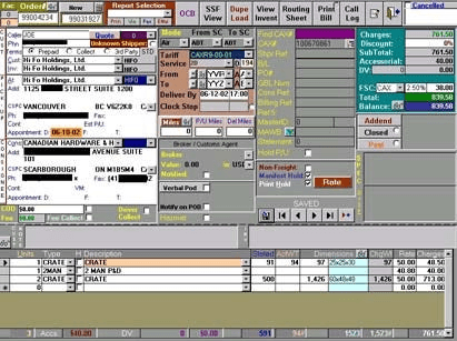
Very small base
There is a small library of colors and some components that are reused, however, the development process was not standardized in terms of visuals, and each developer approached the front end in a different way.
Upon asking the previous questions and consulting with various collaborators, I discovered the following:
Multiple frameworks
Different sections used different frameworks, which resulted in a very varied UI experience.

Incoherent UI
Due to the varied result of using different frameworks, the communication with the user was not clear. Components looked and behaved differently, generating friction and resistance from the users.

📍Where are we?
At the beginning of the process, I focused on understanding how the UI was currently being handled.
I wanted to find out if there were existing resources being used, such as colors, icons, buttons, diagrams, etc. What do developers turn to at the time of taking a ticket? What costs are allowed and which ones are not from a visual standpoint?
To understand where we were positioned when it came to the Design System, I posed the following questions:
What do we have now?
With what tools and resources do we count on when building or refreshing the different sections of the platform.
What framework do we use?
It's important to understand the limitations and benefits of the systems used by developers to proceed with an optimal work pace.
Is the UX/UI Coherent?
The UI is the communication we have with the user.
I was interested in understanding if this communication was being coherent across the different sections, if the user could easily identify what to do with each element.
Upon asking the previous questions and consulting with various collaborators, I discovered the following:
Very small base
There is a small library of colors and some components that are reused, however, the development process was not standardized in terms of visuals, and each developer approached the front end in a different way.
Multiple frameworks
Different sections used different frameworks, which resulted in a very varied UI experience.
Incoherent UI
Due to the varied result of using different frameworks, the communication with the user was not clear. Components looked and behaved differently, generating friction and resistance from the users.
⛳Where are we going?: Objectives for creating a Design System
Once we have a clear starting point, we can begin to define the path forward and the focus of our Design System. What do we intend to achieve at this point?
Optimizing Time

Having predefined components from the design stage that are translated into code streamlines the language for developers.
There's no longer a need to create a button every time one is required; we can reuse one that has already been created, tested, and validated. This results in faster development times, more predictable results, and a smoother experience for developers, who can work more efficiently and with less fear of design errors.
Cohesive Experience

The main focus should always be on the user. My primary goal is to ensure that the user can trust that the platform communicates with them in the same language across all sections, regardless of where they are.
It is essential that a user can easily identify a button, a selector, an input, an alert, etc., without having to consider which section of the platform they are in. By doing this, we reduce cognitive load and free up mental space for the user to focus on the objectives they wish to achieve with the tool.
Moreover, uniformity and cohesion help to identify and differentiate our product easily from our competitors.
Scalability

By identifying a flexible and maintainable framework, creating components allows us to scale our product much more easily. This also facilitates changes that are applied consistently across all uses of the same component, without requiring year-to-year adjustments.
⛳Where are we going?: Objectives for creating a Design System
Once we have a clear starting point, we can begin to define the path forward and the focus of our Design System. What do we intend to achieve at this point?
Optimizing Time
Having predefined components from the design stage that are translated into code streamlines the language for developers.
There's no longer a need to create a button every time one is required; we can reuse one that has already been created, tested, and validated. This results in faster development times, more predictable results, and a smoother experience for developers, who can work more efficiently and with less fear of design errors.
Cohesive Experience
The main focus should always be on the user. My primary goal is to ensure that the user can trust that the platform communicates with them in the same language across all sections, regardless of where they are.
It is essential that a user can easily identify a button, a selector, an input, an alert, etc., without having to consider which section of the platform they are in. By doing this, we reduce cognitive load and free up mental space for the user to focus on the objectives they wish to achieve with the tool.
Moreover, uniformity and cohesion help to identify and differentiate our product easily from our competitors.
Scalability
By identifying a flexible and maintainable framework, creating components allows us to scale our product much more easily. This also facilitates changes that are applied consistently across all uses of the same component, without requiring year-to-year adjustments.
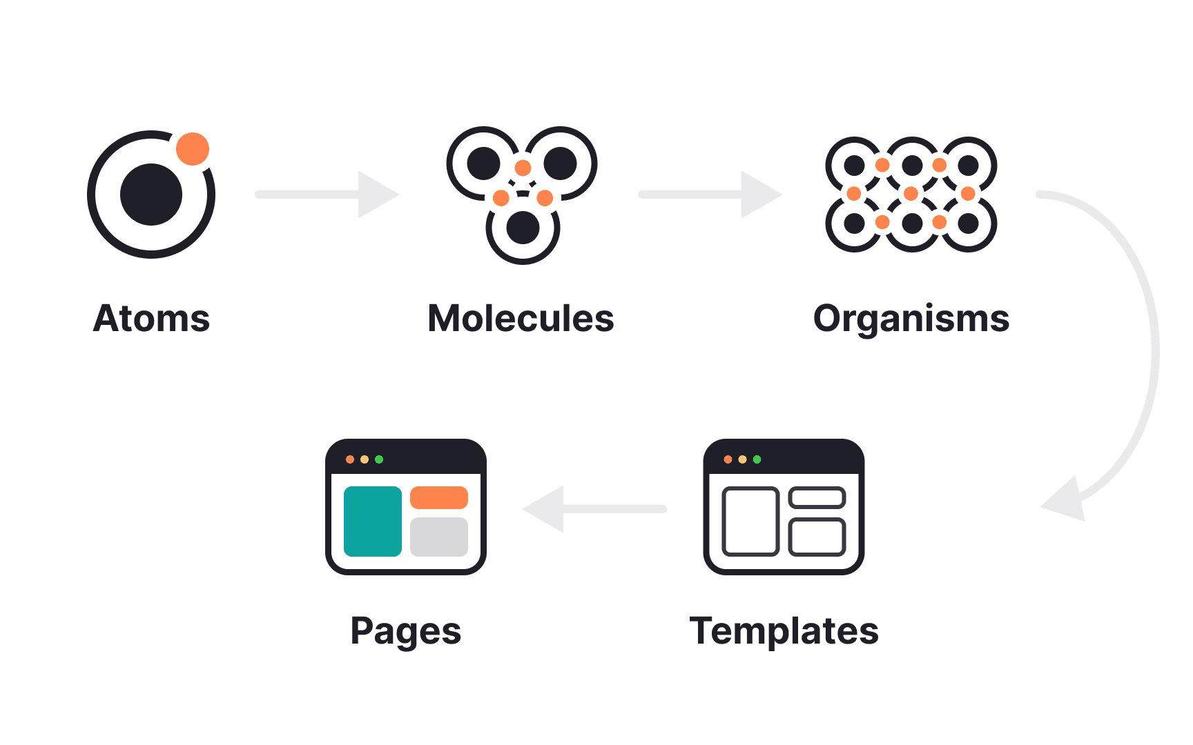
🦠 Atomic Design
The Diamond Design System is based on the concept of Atomic Design, which organizes design components into atomic, molecular, and organism levels for reusability and coherence.
Below are the details of what each section includes:
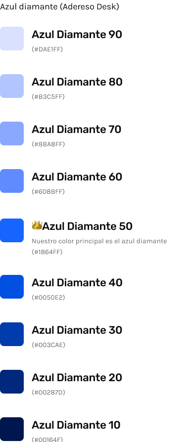
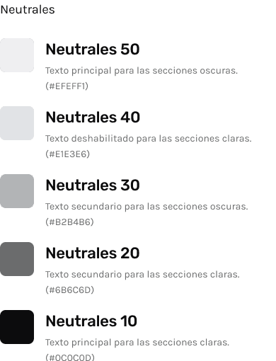
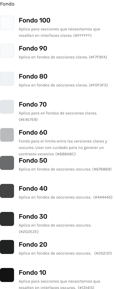
Atoms: These are the most basic details of the entire system, including colors, typography, icons, logos, and spacing. It is important to note that throughout the system, everything is planned under an 8pt grid.
Molecules: This includes small components that are used across various sections, such as buttons, dropdown lists, components for tables, inputs, alerts, tooltips, etc.
Organisms: More specific and structured components, like modal dialogs, alert screens, and forms for data entry, are included here. For this application, I created a specific section for these types of components.
Let's go to Figma
🦠 Atomic Design
The Diamond Design System is based on the concept of Atomic Design, which organizes design components into atomic, molecular, and organism levels for reusability and coherence.
Below are the details of what each section includes:
Atoms: These are the most basic details of the entire system, including colors, typography, icons, logos, and spacing. It is important to note that throughout the system, everything is planned under an 8pt grid.
Molecules: This includes small components that are used across various sections, such as buttons, dropdown lists, components for tables, inputs, alerts, tooltips, etc.
Organisms: More specific and structured components, like modal dialogs, alert screens, and forms for data entry, are included here. For this application, I created a specific section for these types of components.
Let's go to Figma
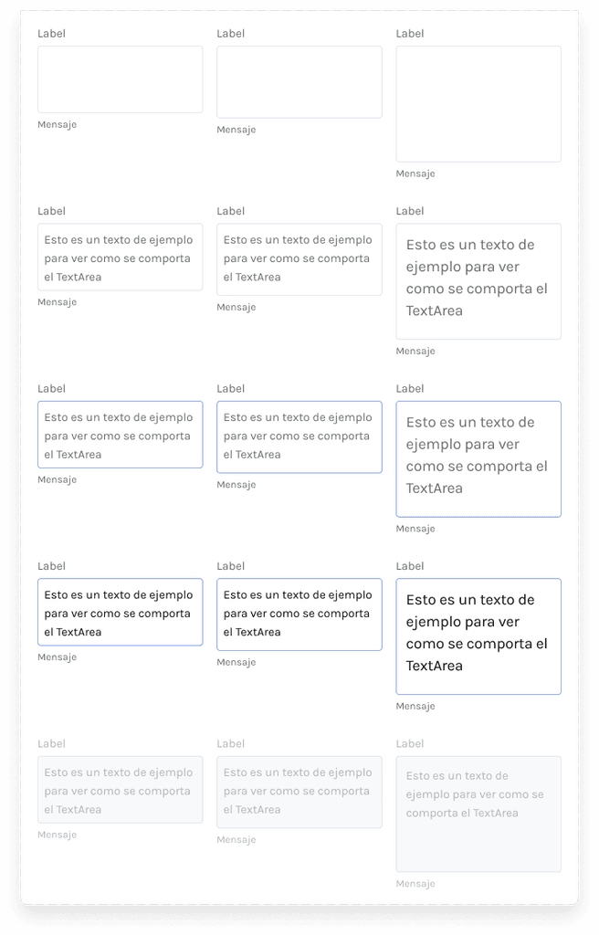
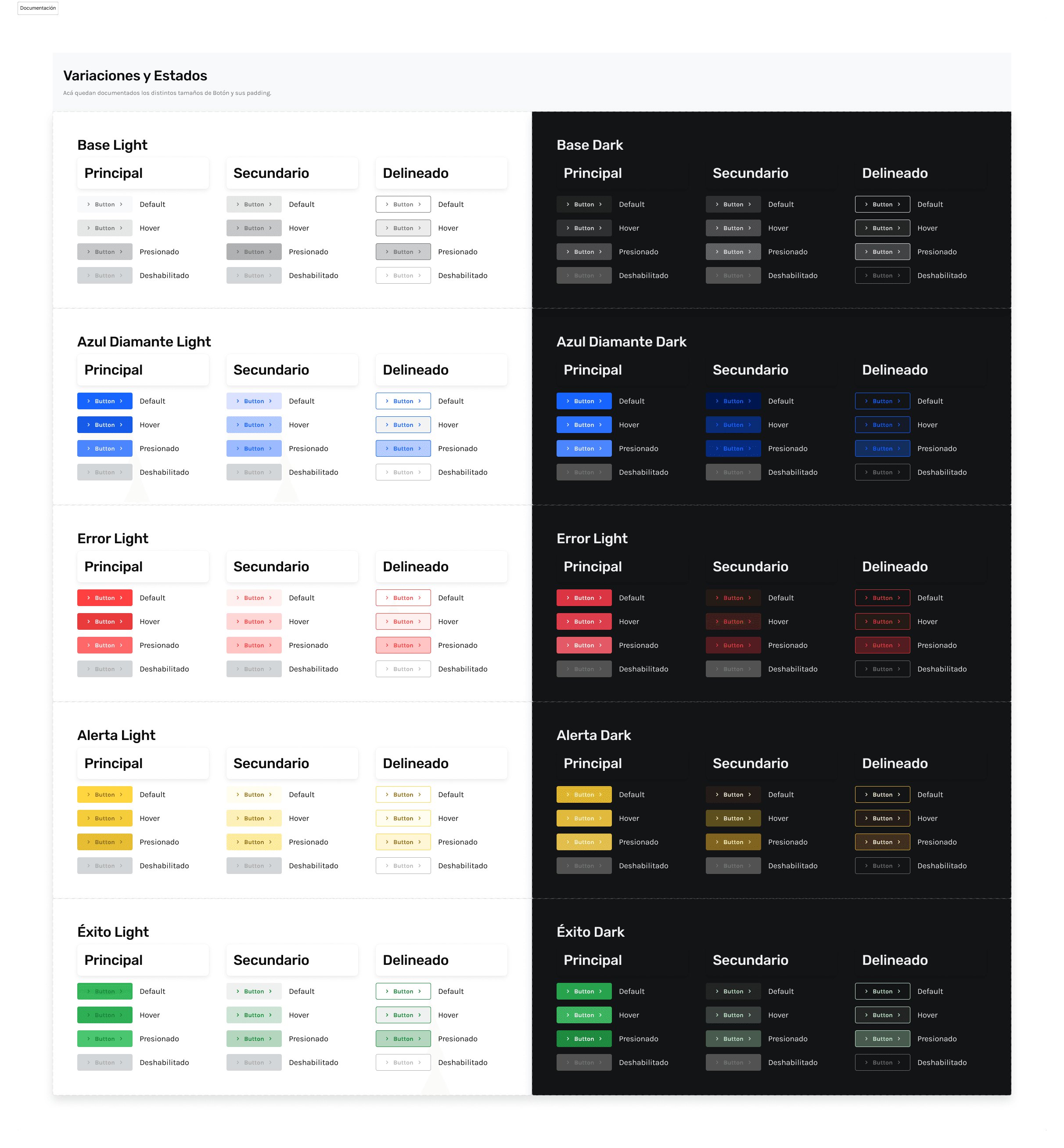
📘Documentation and Handoff
What good is a great design if it can't be understood? If the design is incomprehensible to developers and can't be translated into code, then it is essentially useless.
As part of my efforts, I have focused on detailing as clearly and optimally as possible the handoff to the developers responsible, to ensure that their work can be more efficient.
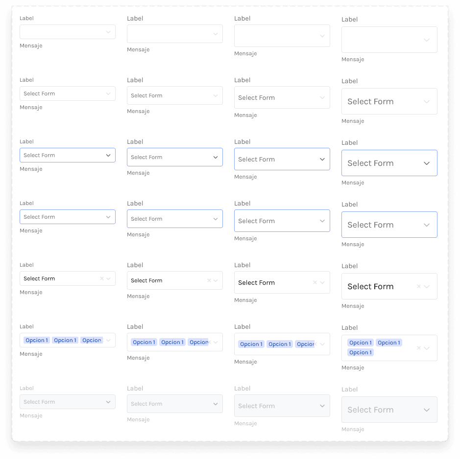
Example: AButton
Documentación AButton
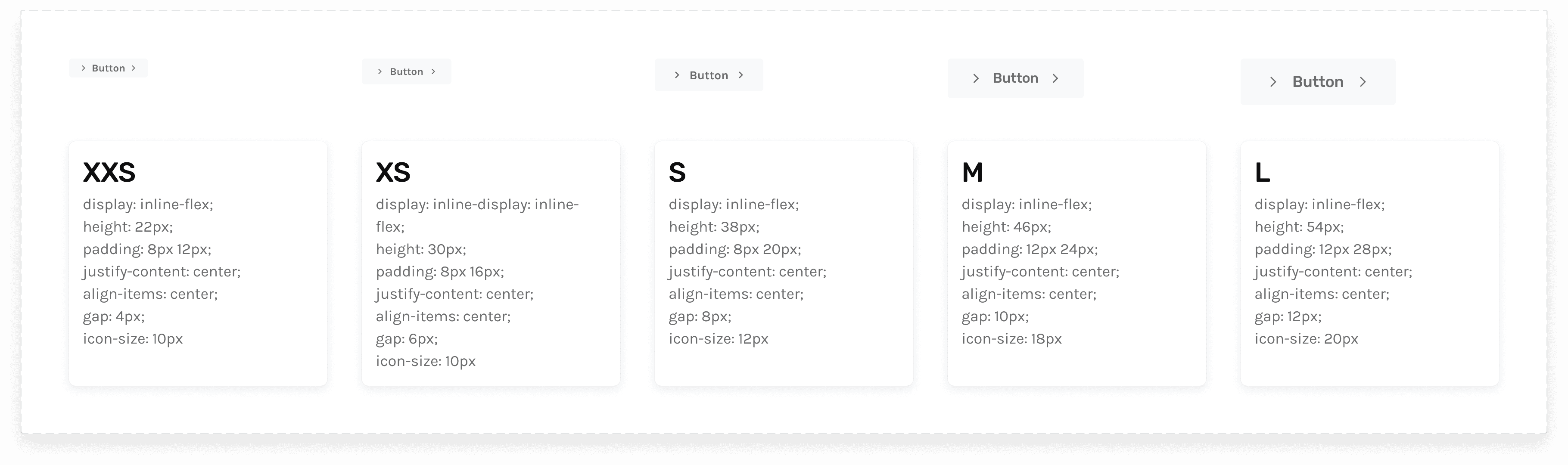
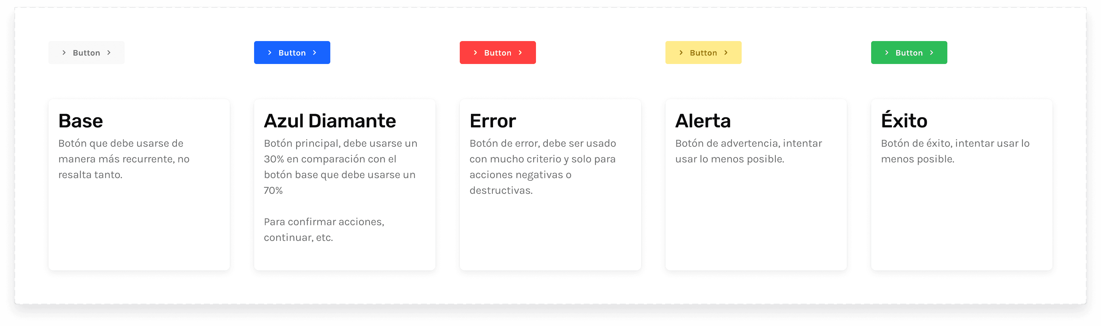
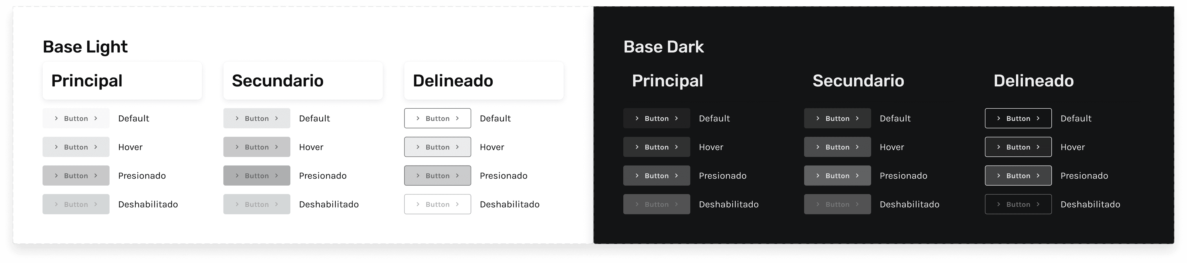
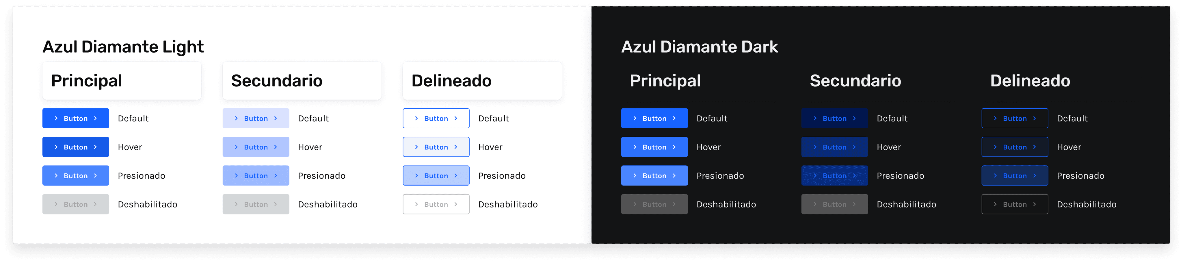
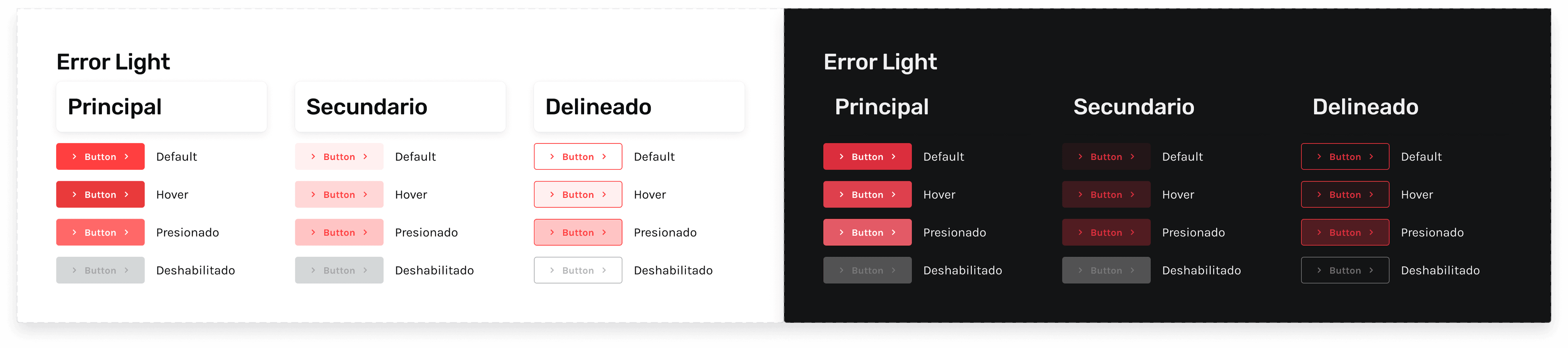
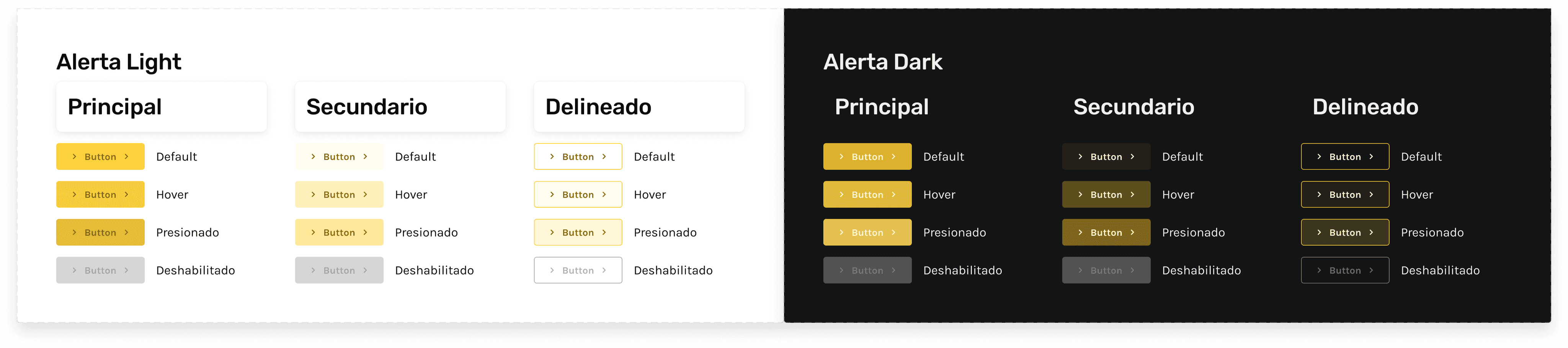
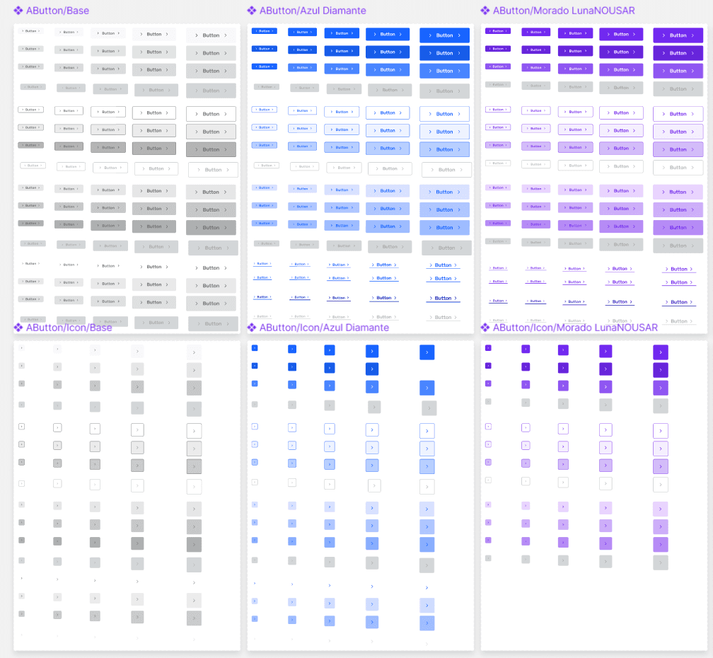
To exemplify this documentation, I want to show the example of the AButton component, which is a button with multiple variations for multiple purposes.
This component would be present throughout the platform, so its development should be as straightforward as possible.
To the right, you can see a capture of the component created and its variations in Figma. Could this go as far as it did? The developer should review it in Figma and interpret it as they see fit.
Indeed, this very "interpretation" is what should save time when transitioning to code. I wanted the developer to be a translator and not have to be overly creative at this stage.
To achieve this, I document the component in terms of code, each variation defined by state, color, size, etc.
Below are some captures from Figma delivered to the developers.
How did I approach this?
By focusing on two key aspects: documentation and explanation.
Documentation, because although very clear documentation helps, memory has its limits and the learning cycle of each developer is different. Some understand with images, others with explanations.
Explanation, because the way we document may not align with a language that developers are familiar with. Beyond language barriers, explaining your documentation and intent allows the developer to understand what we aim to achieve with what we are developing.
This approach allows us to present the design in a way that each developer can adapt to it in their preferred manner, confident that they will find the system always accessible.
📘Documentation and Handoff
What good is a great design if it can't be understood? If the design is incomprehensible to developers and can't be translated into code, then it is essentially useless.
As part of my efforts, I have focused on detailing as clearly and optimally as possible the handoff to the developers responsible, to ensure that their work can be more efficient.
Example: AButton
Documentación AButton
To exemplify this documentation, I want to show the example of the AButton component, which is a button with multiple variations for multiple purposes.
This component would be present throughout the platform, so its development should be as straightforward as possible.
To the right, you can see a capture of the component created and its variations in Figma. Could this go as far as it did? The developer should review it in Figma and interpret it as they see fit.
Indeed, this very "interpretation" is what should save time when transitioning to code. I wanted the developer to be a translator and not have to be overly creative at this stage.
To achieve this, I document the component in terms of code, each variation defined by state, color, size, etc.
Below are some captures from Figma delivered to the developers.
How did I approach this?
By focusing on two key aspects: documentation and explanation.
Documentation, because although very clear documentation helps, memory has its limits and the learning cycle of each developer is different. Some understand with images, others with explanations.
Explanation, because the way we document may not align with a language that developers are familiar with. Beyond language barriers, explaining your documentation and intent allows the developer to understand what we aim to achieve with what we are developing.
This approach allows us to present the design in a way that each developer can adapt to it in their preferred manner, confident that they will find the system always accessible.
👀 The end?
I would love to say that the Design System is complete. But that would only be possible in a perfect world, and perfection does not exist.
What does exist is the constant need for change, in every aspect. This is why the Diamond Design System is an ongoing project. New challenges arise, the product evolves, and previously planned components require adjustments, etc.
This is a sign of the product's good health, so I happily say: This is not the end of this design system, it's just the beginning.